


CX Tech Top-ups- New Features for the Summer!
Our team has been working hard to release new enhancements designed to make your life easier. This month, our featured releases are all about making...
3 min read

2022 at Intouch was all about data. How to do more with your data, dig deeper into your data, and perform better data analysis - and it’s never been easier to do it!
This year our teams were busy releasing great new features that we shared in our monthly product updates. For December, we wanted to highlight some of our favorite platform releases from 2022 that help you drive actionable, real-time insights, no matter which Intouch Insight product you use!
Want to see these in action? Register for our January New Feature Updates, a live, quarterly webinar where we’ll dive into some of these great new product additions!
Enjoy!
Intouch Insight Platform
The Hierarchy Comparison Dashboard is one of our favorite new features that was released in 2022. This dashboard gives users the ability to easily compare data across multiple locations, regions, or hierarchy nodes. The dashboard offers an easy-to-understand visual summary of how various locations are performing compared to each other.
By analyzing and comparing location performance, users may quickly pick out areas and specific locations that are not up to business standards. These insights can be used to inform action plans to scale success or drive improvements moving forward.
Additionally, this dashboard can chart data from multiple programs and products. For example: Customers can now chart CSAT scores with mystery shopping scores AND chart Survey cleanliness scores with operational scores focused on cleanliness.
This dashboard is easily configurable and users can pick the data to be charted on without having to build out all the charts manually. Customers can also create and save multiple versions of the dashboard by using the + sign in the blue bar.
The Comments Dashboard was another powerful dashboard that was released in 2022. This dashboard gives users the ability to easily read all comments captured in their programs. This dashboard brings all comments into one place and saves users from having to manually click into each individual record.
If users have open-ended questions in their program, they can head over to the Comments Dashboard and select the questions they would like to look at. Users can choose up to 10 questions.
Additionally, this dashboard allows users to plot questions from multiple programs and products in the same chart. For example, a user could select questions from their check program and questions from their survey program. Customers can create and save multiple versions of the dashboard by using the + sign in the blue bar.
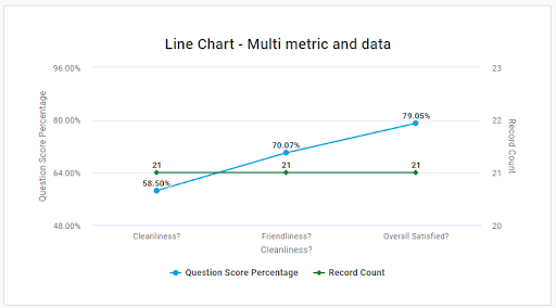
This year we introduced the ability to chart multiple metrics in one chart. This feature allows users to compare two different metric types together for an easy to read analysis.
For example, users may now chart record count and question score percentage. By having the ability to chart these two metrics together, users can understand how many respondents are represented in the score percentage.
We have all been there. Creating a chart for your dashboard, adding the data, metrics, and filters, and then realizing we have chosen the wrong chart type. The launch of our new charting feature, users can change the chart type even if data, metrics, and filters have already been added. This feature ensures that users can find the perfect chart for their data without having to rebuild the configuration each time.
Our new global filters update expanded the list of available items you can segment your data by while also ensuring that applying filters is as simple as possible.
When clicking into filters, users can see a list of available options, the filters that are active on the data set, and any filter configuration settings that have already been saved.
Users can also save configuration settings as a favorite. To do so, head to the active filters tab, and click “Save Filters”. This shortcut will allow users to configure a filter settings once, and then apply the same filters to other data with just one click.
The list of available filters will be dependent on the type of list that is being looked at. For example, if you are on the check standard dashboard, you will only see filter options that are applicable to check.
In addition, there is now a “recent” section when applying global filters. This feature will bring the most recently used filter to the top of the configuration list so users can easily reselect the filters that you have recently used elsewhere.
Stay tuned for 2023 for many new exciting feature releases. If you or your team have any new ideas that you would like to share, please reach out to us at letschat@intouchinsight.com
Our team has been working hard to release new enhancements designed to make your life easier. This month, our featured releases are all about making...
Happy Halloween and happy new features! This month we are happy to announce that we have launched several new features across the Intouch Insight...

At Intouch Insight, we’re constantly working on releasing new features that will help you reach the top of your game. This month we have added...