Web Surveys
%201.svg) Email Surveys
Email Surveys%201.svg) SMS Surveys
SMS Surveys%201%20(1).svg) In-Product Feedback
In-Product Feedback%201.svg) In-App Feedback
In-App Feedback%201.svg) Offline Surveys
Offline Surveys


 Microsurveys
 Feedback Button
 In-App
 Email
Email SMS
SMS Embed Survey in Email
 In-Signature Survey
 API Triggers & Integrations
.svg) Android Survey App
Android Survey App.svg) iOS Survey App
iOS Survey App.svg) Kiosk Surveys
Kiosk Surveys.svg)
%201%20(1).svg)
.svg)

.svg)

 Salesforce
  HubSpot
 ActiveCampaign
 Pipedrive
 Mailchimp
 Zendesk
  Freshdesk
 HelpScout
  Front
Front Slack
Slack  MS Teams
 Webex
Webex Zoom
Zoom Google Sheets
  Zapier
  Integrately
 Webhooks
  Developer APIs


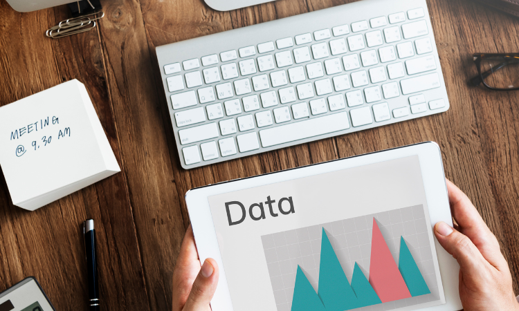
In the business world, data is king. The ability to collect, analyze, and interpret data is critical to make informed decisions that can improve business operations and, ultimately, the bottom line.
One of the most effective ways to communicate data-driven insights is through analytical charts and visualizations. Charts and graphs can transform complex data into easy-to-understand visualizations that can help to improve decision-making.
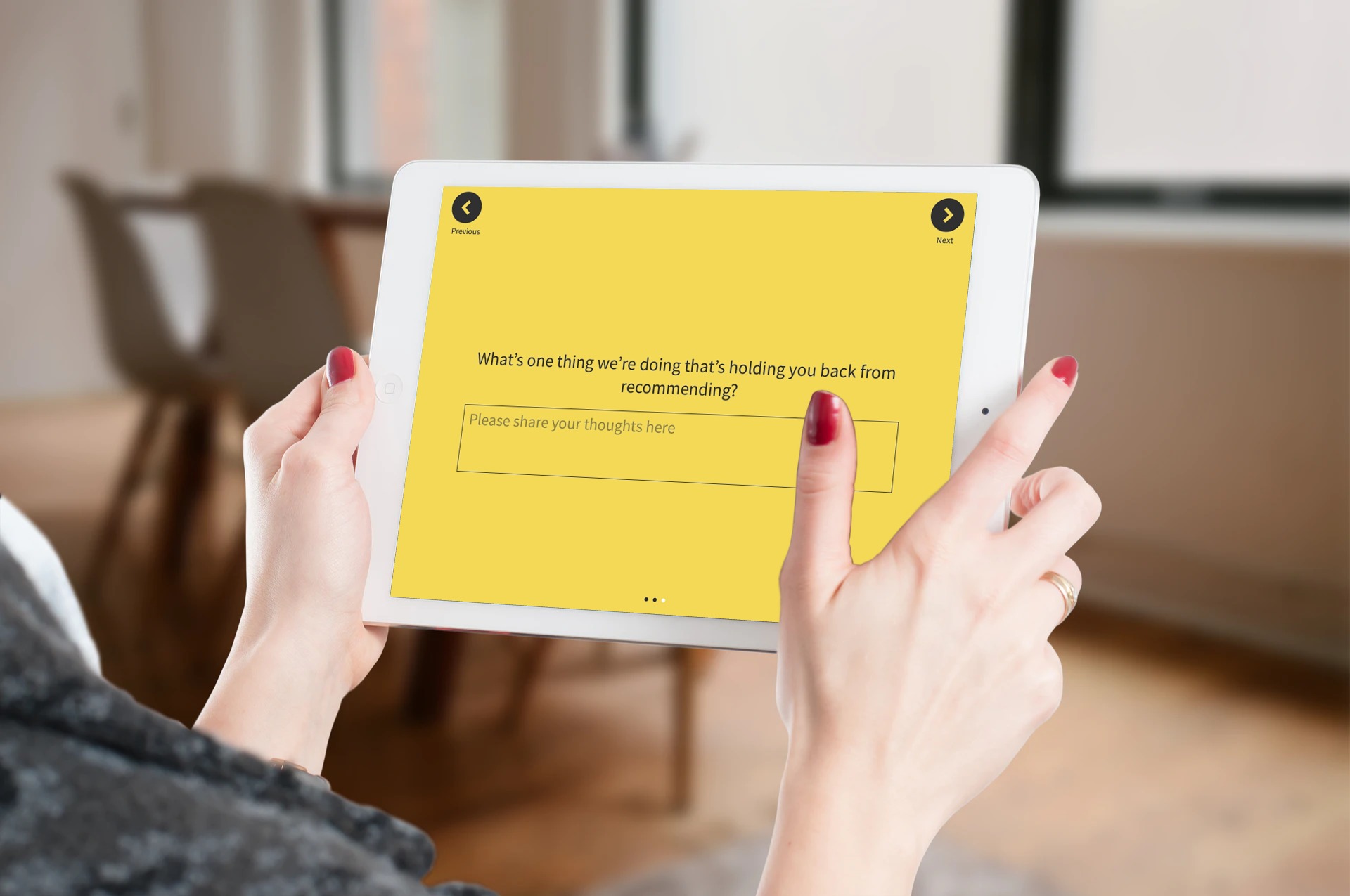
Elevate CX with Customer Feedback🔥
Collect real-time, in-moment feedback at all touchpoints in customer journey and leverage feedback insights to transform customer experience.

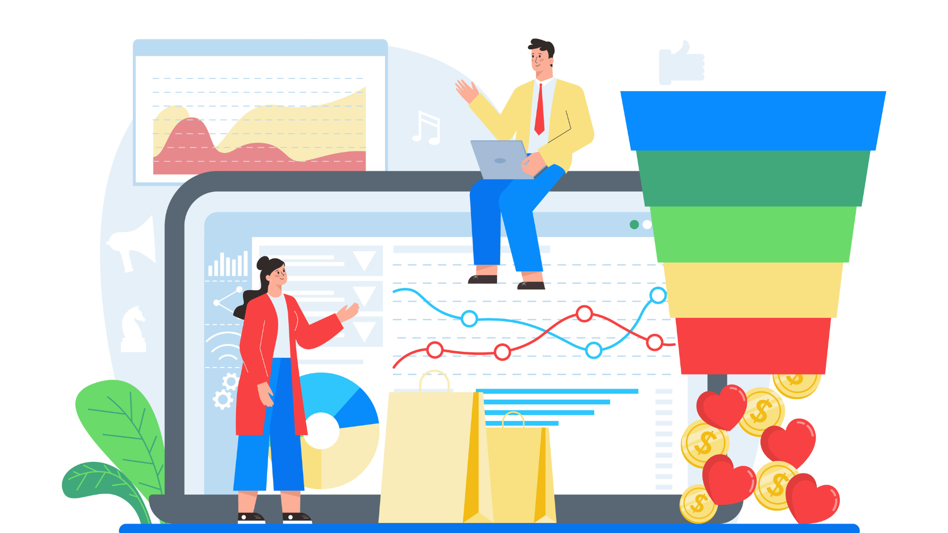
Analytical charts and visualizations play an essential role in the consumer experience. They help organizations understand consumer behavior and preferences. You can also use them to identify areas of improvement in the customer experience. Organizations must choose the right one based on their needs and requirements.
This blog post will discuss using analytical charts and visualizations to improve the consumer experience.
How Analytical Charts and Visualizations Enhance Consumer Experience
.jpg?width=512&height=315&name=unnamed%20(17).jpg)
How much time does it take to analyze data from multiple sources and create visualizations?
Data visualization has become an essential part of our daily lives. From stock charts to weather forecasts, we rely heavily on visual representations of information. Creating these visuals takes a lot of time and effort.
Analytics tools such as Tableau, Qlikview, ChartExpo, and Power BI, and marketing mix modeling software allow us to visualize and share data across teams, departments, and countries. These tools provide a way to build dashboards and report that anyone can share quickly.
Here is how they enhance consumer experience:
Customer Participation
.png?width=512&height=273&name=unnamed%20(6).png)
The customer experience is enhanced when consumers have access to information about their products and services. Consumers want to know what they're buying and how it works. So, to provide these answers, companies must ensure that they provide the correct information at the right time. Remember, businesses concentrating on enhancing customer experience see an 80% boost in revenue.
Customer service was previously based on one-dimensional, automated interactions and static texts. The interaction between a company and its customers has now reached a completely new degree of engagement because of big data visualization.
Businesses use a variety of analytical charts such as flow charts, trend charts, Sankey charts, and other visualization strategies to encourage customer interaction. Application (app) dashboards or real-time live sessions are two examples of this. As the clients alter any of the contributing components, they continue to receive updates. They may decide more quickly and effectively how they want to complete particular activities thanks to this, which improves the customer experience.
To assist consumers in understanding their expenses, banks, credit facilities, and investment centers have included various data visualization tools. To distinguish between their allocations for spending and saving, this could take the form of a pie chart or trending graphs. The idea is to create a customer-centric design that addresses their demands while maximizing the value of the data found in a customer's financial records.
Product Performance Analysis
Although 40% of marketers base their decisions on consumer research, companies should use analytics trends to understand the performance of their products and services. Web API scrapping & Customer feedback analytics help companies identify trends, patterns, and anomalies in real-time. Companies can then look into new ways of interpreting various types of data whether numerical or graphs aquired and take action based on the insights gained from the analysis.
Analytical charts and visualizations, mainly when used to analyze a product or service's performance, significantly improve the user experience. It aids in locating and monitoring client problems, client participation, and even runtime performance.
When you delve further, it makes it possible to see trends in macro (i.e., all customers) and micro (i.e., individual customers) behavior for particular goods or services. These data points provide firms with practical insights that enable quick response and customer-centered adaptation.
Analytical Charts and Visualizations Helps In Understanding Data Consumption Objectives
Data consumption is the amount consumed by a company's business processes. Companies should use the right tools to measure and analyze data consumption. These tools can help companies determine if they are consuming enough data and whether they are getting value out of the data they consume.
What data or information does a user need to access? It can be understood and answered with data visualization tools when customer engagement data is sufficient. How and when? What is the least amount of information necessary to resolve the user's query? Data visualization provides answers to some of these questions.
Helps Improve Mobile-First Design
-1.png?width=512&height=247&name=unnamed%20(7)-1.png)
Mobile devices are now ubiquitous. As a result, many people are accessing websites, apps, and even their building entry system via smartphones and tablets. A mobile-first approach means designing sites and apps for mobile devices and scaling those designs up for desktop browsers.
Through mobile-first design, data visualization is easier. Consumers can get large amounts of crucial data on screens that are too small. They can display important information that might typically fill an entire webpage in compact, responsive figures that fit nicely on a mobile device's small display.
According to consumer statistics, using mobile-first increases customer engagement and lengthens trips. In fact, according to 73.1% of web designers, a non-responsive design is the main reason users quit a website.
Identifying Customers with Recurring Issues
-1.png?width=512&height=205&name=unnamed%20(8)-1.png)
Finding consumers with recurring problems is another aim of improving customer experience design. Teams can assign special codes to these people to track their problems as they deal with the business.
Data visualization can make it simpler to engage with these clients individually and update them on the status of their issues, as well as help distinguish this data from other typical contacts. Visualization can also assist in using this data later to address further recurrent issues that improve client retention.
Customers who have had problems with a particular product or service may not return to purchase again. A study by 1st Financial Training Services found that 96% of dissatisfied consumers don't complain, and 91% will go and never return. However, these customers may be willing to share their experiences with others.
Conclusion
Data visualization is a powerful tool that you can use to improve customer experiences. Data visualizations can help businesses make better decisions, understand their customers, and improve the overall customer experience. Now that you understand how data visualization can help improve customer experiences, it's time to start! Implementing even a few tips we've discussed can significantly impact your business. So what are you waiting for? Start using analytical charts and data visualizations today, and watch your customer experiences improve and customer satisfaction go up!