


10 Strategies for Optimizing SaaS Design: Leveraging the Psychology of Colors for Positive User Experiences

Contents
This is why it’s vital to optimize SaaS design with strategic color choices in the digital world, subtly directing users, influencing emotions, and shaping their entire experience.
This is not just about aesthetics; it’s a hidden language, whispering promises of trust, progress, and joy through each pixel.
This article delves into the captivating world of color psychology in SaaS design. We’ll unveil 10 powerful strategies to unlock the chromatic potential of your platform, crafting experiences that delight your users and drive engagement and success.
Forget clunky interfaces and confusing navigation—we’ll paint your SaaS with shades of intuitive guidance, emotional resonance, and user satisfaction. So, are you ready to unleash the magic of color and transform your platform into a vibrant oasis for your users? Let’s begin.
10 Strategies for Optimizing SaaS Design
1. Aligning Design with Identity
Picking colors for your brand is more than just making things look nice; it’s like giving your brand its own special language. Choose colors that match what your brand is all about – being safe and reliable.
Blues and greens are like the quiet sidekicks that say, “Hey, you can trust us.”
Want to be bold and full of energy? Go for lively reds and oranges that shout, “Let’s get things done!”
Now, think about what your brand stands for.
If you want to feel safe and calm, stick to cool blues and soft greens. If you’re more into being bold and playful, go for bright oranges and friendly yellows that give everything a lively feel.
And here’s a cool trick for SaaS design: use the same colors everywhere. From the first login screen to your invoices, let your chosen colors show up in everything. It’s like painting a picture of your brand with every click, making sure everyone remembers what makes your brand special.
Think Slack’s playful purple, evoking creativity and collaboration. Or Trello’s rainbow, mirroring project management’s dynamic world. These platforms master aligning colors with their identity, attracting users and forging deep emotional connections.
2. Navigating the User Flow
Color is your secret navigation map, easily guiding users through your SaaS interface. Think of contrasting hues like a spotlight, illuminating key elements:
- Warm colors like green or orange shine bright on call-to-action buttons, drawing attention and nudging users to click.
- Cooler tones like blue or gray provide a calming background for information areas, making data easy to absorb.
But color isn’t just about highlighting; it can prioritize information, too. Think of headings in bold blue against a white background, instantly guiding users to crucial details. This creates a visual hierarchy, helping users understand what’s most important at a glance.
By strategically using color contrast and hierarchy, you can transform your interface into a smooth, intuitive highway, confidently leading users to their goals.
Spotify’s vibrant interface seamlessly blends music discovery with user-friendly navigation. Green, their signature color, pops on vital elements like play buttons and progress bars, guiding users towards their musical desires. Subtler grays and blues create a calming backdrop for browsing, ensuring information like album covers and song titles are easily digestible.

3. Evoking the Right Feelings
Beyond aesthetics, color whispers emotions, influencing how users interact with your platform.
- Red: Energetic, exciting, perfect for urgent alerts or inspiring action. Use cautiously, as too much can feel overwhelming.
- Green: Growth, security, ideal for progress bars or celebrating completed tasks. Creates a sense of calm progress.
- Blue: Trustworthy, calming, and excellent for data visualizations or areas where users analyze information.
- Yellow: Optimistic, playful, can highlight key actions or add a touch of fun. Use sparingly to avoid overwhelming users.
Successful SaaS platforms use color strategically.
Think about the emotional journey you want users to experience.
Feeling lost? Use calming blues to guide them. Want them to take action? Highlight buttons with a pop of green.
Aligning color with emotion lets you create a positive and engaging user experience, and optimize SaaS design.
For instance, Trello’s vibrant palette reflects project management’s dynamic nature, while Slack’s inviting purple fosters creativity and collaboration.
4. Gathering Customer Feedback
Your users hold the key to unlocking the perfect color palette! Involving them in the design process is crucial for understanding their preferences and emotional responses to color choices.
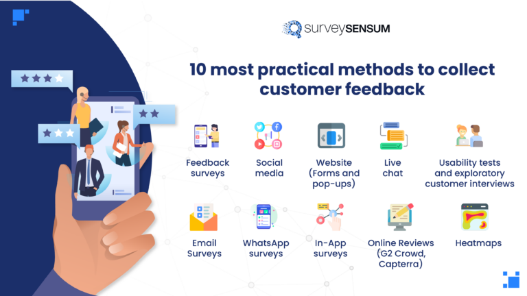
So, gather customer feedback through:
- Surveys: Ask targeted questions about preferred colors for elements like CTAs or dashboards.
- A/B testing: Experiment with color variations and track user engagement to see what resonates best.
- User interviews: Conduct in-depth discussions to understand how colors impact their experience and perception of your brand.
Gather Customer Feedback the Right Way With SurveySensum!
Free Forever • No Feature Limitation • No Credit Card Required • Get a Live Demo ![]()
Structure feedback sessions effectively:
- Present clear options: Don’t overwhelm users with endless choices, offer a curated selection to focus their feedback.
- Ask open-ended questions: Go beyond “Do you like this color?” Encourage users to explain their emotional responses and associations.
- Actively listen and analyze: Respond to non-verbal cues and objectively interpret feedback to identify trends and preferences. You may want to include a Google competitor analysis to further tailor your strategies.
Customer feedback is a powerful tool for refining your color design. Listening carefully and adapting your palette based on their insights allows you to optimize SaaS design, which, in turn, creates a platform that truly resonates with your audience.
5. Ensuring Accessibility
Everyone deserves a smooth SaaS experience, including the estimated 300 million people globally who experience color blindness or visual impairments. Here’s how to make your color choices inclusive:
- Use the Web Content Accessibility Guidelines to choose contrasting colors that work for different vision types and further improve website usability.
- Important information shouldn’t depend solely on color (e.g., red text shouldn’t be the only indicator of an error).
- Allow users to switch to high-contrast or grayscale interfaces to customize their experience and optimize SaaS design.
Platforms like Dropbox excel at accessibility. Its contrasting color combinations and optional color schemes ensure everyone can navigate and enjoy their features.
You can also optimize SaaS design by making color choices accessible. This way, you embrace diversity and avoid potential legal issues related to web accessibility standards.
6. Embracing Cultural Nuances
Colors whisper different stories in different ears. What works in one market might confuse or even offend in another. Understanding cultural color meanings is crucial:
- Red in Western cultures may signal excitement, but it represents luck and celebration in China. Overlooking this can lead to misinterpretations.
- Black signifies death in Western cultures, but in Japan, it represents sophistication and power. Using it inappropriately can damage your brand.
Research your target audience! Dig into their cultural color associations to:
- Avoid unintentional faux pas: Choose colors that resonate, not clash.
- Build trust and connection: Colors aligned with local meanings feel welcoming and familiar.
- Strengthen your brand presence: Adapt your palette to fit your target audience’s cultural context.
Remember, color is a powerful language. Speak it fluently across cultures, and your SaaS platform will become a welcoming space for everyone.
7. Emphasizing Success
Positive reinforcement isn’t just feel-good, like celebrating progress with green check marks or blue progress bars. It’s science! Studies show seeing these colors enhances user satisfaction and encourages them to keep going.
Why? Colors like green and blue trigger the brain’s reward system, like receiving praise or a small treat. These positive associations, rooted in health psychology, motivate users and build a sense of accomplishment.
Platforms like Duolingo master this. Every completed lesson explodes in green confetti, reinforcing progress and driving users to conquer the next. You create a feedback loop that keeps users engaged and motivated by strategically linking positive colors to successful actions.
Celebrating wins with color isn’t just about aesthetics. It’s about nurturing positive user behavior and building lasting engagement in your platform.
8. Creating Visual Hierarchy
Color isn’t just decoration; it organizes your interface, guides users’ eyes, and prioritizes information. Think of it like a map, highlighting key points:
- Contrast is key: Bold colors like blue headings against a white background instantly grab attention and tell users what’s important.
- Lighter shades for supporting information: Use softer hues for secondary details, like data labels, without distracting from main points.
- Varying shades within a color: Deeper shades can emphasize specific elements within a section, like highlighting completed steps in a progress bar.
Successful platforms like Asana use color hierarchy masterfully. Their vibrant green checkmarks on completed tasks stand out against lighter gray backgrounds, guiding users and celebrating progress.
9. A/B Testing Your Choices
Guessing isn’t your best friend when it comes to color choices. A/B testing lets you use data to validate your design and optimize user experience.
Think of it like a color duel! Show two versions of your interface, each with a different color variation, to some of your users. Track their engagement, conversion rates, and other key metrics to see which hue reigns supreme.
Here’s how to set up your color A/B test:
- Select specific website design elements like CTAs or progress bars to test color variations.
- Pick clear and contrasting color options to ensure a compelling test.
- Monitor relevant metrics like clicks, conversions, and user feedback to see which color drives better results.
- Analyze the data objectively and update your design with the color that emerged victorious.
A/B testing isn’t a one-time event. Continuously experiment and refine your color palette based on data to ensure your platform keeps evolving and delivering the best possible user experience.

10. Maintaining Color Consistency
Your colors aren’t just for your SaaS platform. They’re your brand’s signature, woven into every touchpoint: website, mobile app, marketing materials, and social media. Consistency is key:
- Consistent colors act like a visual beacon, making your brand instantly recognizable across all channels.
- A unified color palette conveys professionalism and builds trust with users, reassuring them they’re dealing with a cohesive brand.
- Consistent colors across platforms create a familiar and comfortable environment, guiding users intuitively and seamlessly.
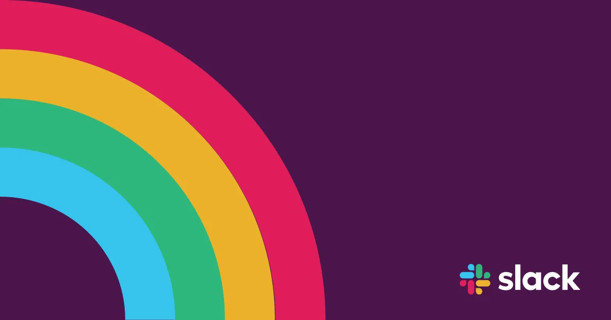
Take Slack’s vibrant purple or Trello’s playful rainbow. These color palettes aren’t just window-dressing; they’re embedded in every aspect of the brand, solidifying their presence and creating a unified user experience.
Make your colors your signature, and watch your SaaS platform rise to iconic heights.
Beyond the UI: Painting a Positive User Journey with Color Psychology
We’ve explored 10 powerful strategies to transform your SaaS design with color psychology. From guiding users intuitively to evoking positive emotions and fostering trust, color is your secret weapon for crafting an exceptional user experience.
So, unleash your inner color maestro! Experiment with these strategies, discover the emotional language of hues and watch your platform soar to new heights. Share your journey, learnings, and color-fueled successes with the community. Together, let’s paint the world of SaaS with vibrant, user-centric experiences!
Unlock the Power of Positive User Experiences with SurveySensum!
Free Forever • No Feature Limitation • No Credit Card Required • Sign Up For Free ![]()