Survey design has a lot of moving parts.
You have to word your questions carefully in order to avoid introducing bias, your response options need to cover all possible answers, and you need to make good use of logic to keep your response rates nice and high (and that’s just a few of many considerations).
What many survey programmers tend to overlook are the visual components of their survey. Surveys aren’t just words on a page. Font and color choices matter.
While they may seem minor compared to question types and reporting values, these are key factors in putting together an effective data collection tool.
Fonts and colors have a serious impact on how respondents perceive your survey; these perceptions influence how they respond, which in turn has an effect on your data.
Look over these basic principles of font and color choice, so the data from your next survey project won’t be tainted by misperceptions.
Survey Design 101: Font Choice Basics
Your first order of business when choosing a survey font is readability. You want to make sure people can read your questions and response options easily, otherwise they won’t be able to provide you with accurate answers.
The second priority should be creating the right subconscious message for your audience.
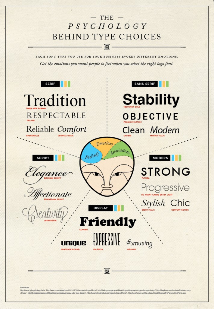
There are six main categories of fonts:
- Serif: Traditional, respectable, stable, reliable. Typically read best in printed materials. Examples: Times New Roman, Georgia, Baskerville.
- Sans serif: Objective, simple, straightforward, sensible. Common choice for digital reading. Examples: Helvetica, Verdana, Arial.
- Script: Personal, feminine, fancy, elegant. Best used in moderation, as they can be difficult to read. Examples: Lobster, Pacifico, Brush Script.
- Modern: Friendly, quirky, unconventional, fashionable. Often associated with technology and innovation. Examples: Infinity, Politica, Matchbook.
- Display: Smart, trendy, forward-thinking, quirky. Designed to be displayed at large sizes. Examples: Carousel, Amerika, Collegiate.
- Decorative: Fun, unique, casual, informal. Often custom made; typically best for headlines rather than body copy. Examples: Papyrus, Cracked, Jokerman.
Are you building a fun, whimsical quiz? Decorative or modern fonts can help reinforce the entertainment factor.
Hoping for a neutral tone to avoid bias in your brand awareness survey? Stick with basic serif or sans serif choices.
Usability expert Dan Partain is a strong believer in choosing the right font for a survey:
Your font choice sets the tone for your survey. Before even reading the words, a respondent sees the shapes of the words and instantly judges your book by its cover. Want to keep it all business? Stick to something easy to read and without anything that looks too “Designy.” Lato, Arial, Verdana, Roboto, and Montserrat are all good choices.
Whether we consider it or not, our fonts will have an impact on the way people perceive our survey. Take a few minutes to choose carefully so you can send a message that matches your larger survey goals.
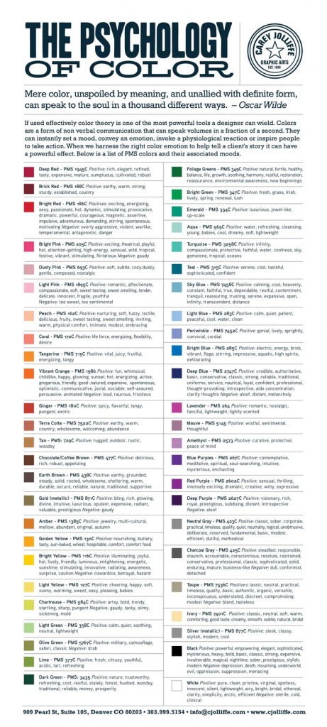
Colors and Survey Design
Red, for example, can be perceived as exciting and energizing, but it can also seem violent and dangerous. A good alternative might be something closer to tangerine, an orange/red hybrid that comes off as energizing with aggressive undertones.
Deep blue is often seen as a “safe” color choice, as it conveys feelings of credibility and authority. On the other hand, there’s the risk of this color coming off as aloof, distant, or melancholy.
What we have to remember when designing surveys is that all of our color choices need to combine to create the final feeling we want to offer our respondents.
New to color theory? Check out this awesome guide to positive and negative emotions that colors can stimulate:
Choosing Colors to Enhance Survey Design, Readability and Usability
While emotional impact is an important consideration for color choice, accessibility is key as well.
High contrast helps visually impaired respondents see your questions and answers, and for users taking a survey on mobile, color contrast can be particularly helpful.
Keep in mind that some data points may get completely lost on those who are colorblind if you rely too heavily on color to show options.
Our usability expert reminds us:
Color choice is more than just matching your logo, you need to keep readability and contrast in mind. You can’t go wrong with keeping the main page white and the text black, even if you want to spice things up with the window background and buttons. If you do want color on the page, don’t make it too bright, and don’t have the text too close to the background color.
Looking for a good basic rule of thumb? Dan tells us, “Don’t make respondents work harder than you.”
——————
Sources:
https://www.companyfolders.com/blog/font-psychology-how-typefaces-hack-our-brains
https://visual.ly/psychology-fonts