As a result of data overload, dashboards have long been a commonly used data visualization tool for business intelligence and data teams. However, we've identified a number of trends that are leading to insights professionals and researchers turning towards this visual and interactive method of displaying data and telling stories. So why is this happening?
- Scalability
Insights leaders are actively looking to operationalize and standardize common applications to reserve researcher bandwidth for strategic thinking. - Do-it-yourself (DIY) & knowledge management
Teams are showing an increased tendency towards centralized platforms for analytics, reporting, visualization, and sharing for streamlined knowledge management. - Increase in longitudinal tracking
As a result of COVID accelerating changes in consumer attitudes and behaviors, it is now critical for insights teams to find cost effective ways of pinpointing trends and showing how these are evolving over time. - Need for speed
Having become used to the the immediacy of big data, stakeholders are increasingly demanding insights instantly in an easy-to-comprehend format.
Fortunately, there is a simple solution to help you embrace all of these trends—dashboards.
Why use dashboards?
You do tons of work around planning and executing your community and research programs. Dashboards offer the perfect solution to help you and your teams understand the vast amount of underlying data and make informed decisions. Dashboards are:
- Digestible - visual, well laid out charts allow stakeholders to see patterns and trends in the data
- Interactive - helps stakeholders explore the data easily to glean insights that are relevant to their needs
- Instant - results get updated in real time to facilitate quick business decisions
- Efficient - intuitive to build and easy to customize for different stakeholders
What kind of data should you visualize with dashboards?
When executed effectively, dashboards can provide an elegant solution to displaying data across many of your research and insights projects. Typically we are seeing an increase in dashboard usage across three types of datasets:
1. Ongoing research programs
These dashboards focus on tapping into the customer pulse by understanding attitudes, behaviors, and pain points across the year so you can improve products, messaging, and the overall customer experience.
Examples of these longitudinal projects might include:
-
- Seasonal behavior dashboards - Retailers can track seasonal shopper behavior against key metrics to optimize merchandising and marketing strategies.
- Category usage & attitudes - Dashboards allow you to monitor evolving customer behaviors in relation to each of your product or advertising categories.
- Customer or employee experience measurement - Access dashboards with real-time information about your CX and EX programs, including community and survey respondents, along with the ability to monitor key performance indicators and how they vary over time.
2. Repeatable, templated programs
These dashboards ensure agile insights are scalable and repeatable, so you can conserve time and headspace for strategic projects and complex problems.
Examples include:
-
- Product innovation dashboard - Visualize an online scorecard that reflects how your product concepts fare against key metrics for different customer segments.
- Creative, advertising or message testing - Track how your creative, advertising, or messaging resonates with your audiences and standardize testing against key metrics so stakeholders can see what makes a good creative.
3. Projects or datasets requiring frequent stakeholder reach
These dashboards enable your stakeholders with ongoing access to the same insights to make decisions or share with internal or external clients. This allows them to self-serve the insights or datasets they use the most, saving your researchers’ time for discovering new insights.
Examples include:
-
- Community composition dashboard - Dashboards that provide real-time visibility to stakeholders into community composition, demographic so they can understand who they have access to.
- Audience insights dashboards for media monetization - Dashboards that allow you to track audience receptiveness towards advertising and content in specific categories (e.g., travel, fashion, wellness, etc.) to guide pitches to media planners and advertising partners.
Going beyond third-party tools
You may have access to dashboard tools that other functional teams use in your organization. Using them in your research efforts becomes a cumbersome process of importing data from your community, survey system, or other tools you use to collect data and then exporting into the dashboarding tool before you can massage and analyze the data to generate dashboards. This creates a dependency on your IT teams. The process also needs periodic monitoring to ensure there’s no data discrepancy between the two platforms. The insights that you eventually surface lose context as they do not reflect the current state of your program.
It’s not uncommon that insight professionals also resort to using applications like excel and powerpoint for their reporting and visualization needs. While it may serve ad hoc needs, the process is manual, time consuming, error-prone, and is certainly not scalable.
One integrated analytics and dashboard platform
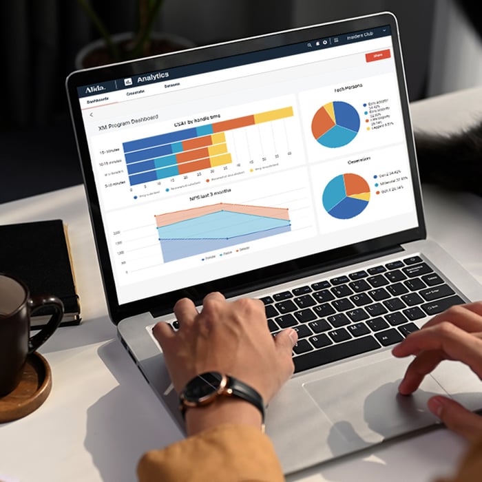
What you need is a comprehensive analytics and dashboard tool that can seamlessly integrate with your community, survey, and research toolkit. Alida Analytics does just that. It natively integrates with Alida Sparq and Alida Surveys and a number of third-party business applications to provide a consolidated dashboard solution with pre-packaged dashboard templates purpose built for CX & Insights initiatives.
Community and survey data flow is seamless and occurs in real time. You accelerate time to value with built-in capabilities to combine large and complex datasets, analyze both qualitative and quantitative data, and build content-rich dashboards that are fully customizable to suit your varied needs.
Dashboards update dynamically with the click of a button so you and your teams always have access to data in real time. Stakeholders can interact with dashboards by clicking on data points and applying filters. You can easily socialize dashboards across devices and channels to ensure cross-functional collaboration and visibility into your programs.
Before you drown in data, find a way to present the findings from your research and community programs in an easy yet compelling way. This will become paramount to ensuring program visibility, building stakeholder consensus, and driving business decision making. Make the most out of the amazing work your team is doing in a way that’s scalable and doesn’t slow the pace of business. All of these can be achieved with the right dashboards.
Talk to the Alida team today to learn more about how Alida Analytics can work for you.