


20 Social Media Holidays to Celebrate This May
By Yasmin PierreApr 10
Unlock the secrets to staying ahead in the ever-evolving world of social media marketing.
Published January 7th 2019
I’ve never been more flustered going into an interview for the Brandwatch blog.
I’m chatting to Russell and Caitlyn from The Pudding, and I’ve been admiring their work for ages. In fact, lots of us at Brandwatch love The Pudding – a quick Slack search revealed a whole bunch of Brandwatchers recommending their different pieces, surrounded by adoring emoji reactions.
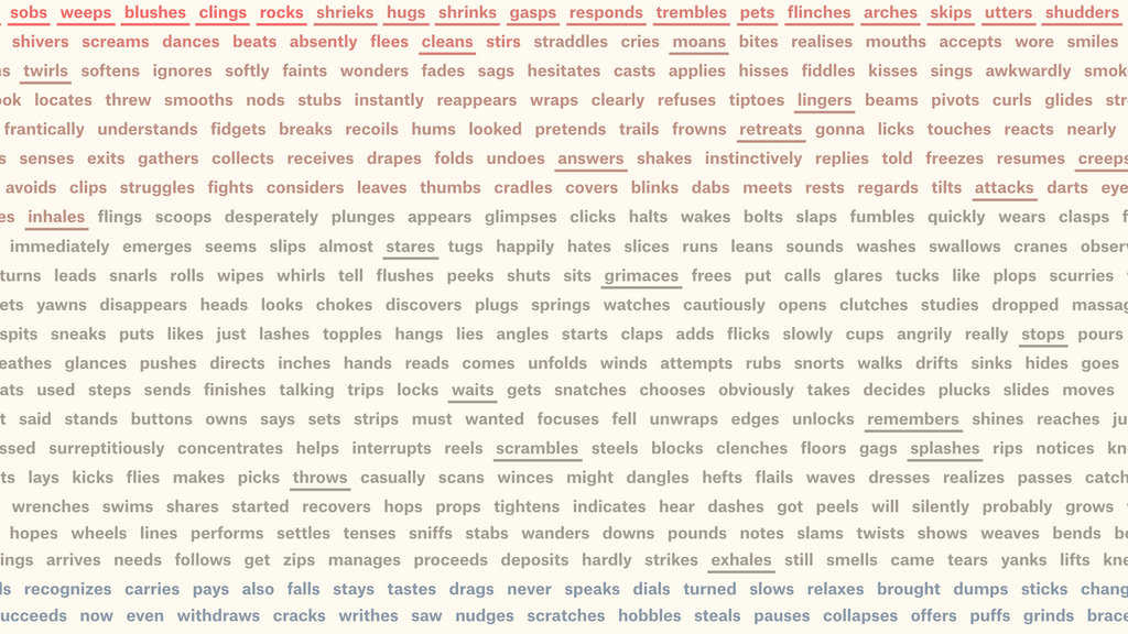
If you’re wondering what I’m talking about, The Pudding is an incredible collection of visual essays based on a range of different datasets.
They cover everything from gender representation in movies to the emergence of slang. If you haven’t seen their work before, stop right now and educate yourself.
The Pudding started as a tiny project between Matt Daniels, Ilia Blinderman and Russell Goldenberg, who were passionate about data visualization and, crucially, knew how to do it.
Russell told me he was a data journalist at the Boston Globe when he started searching for a project with more creative freedom. He joined forces with Matt and Ilia to launch The Pudding in 2017.
Since then, the team’s grown to six people including Caitlyn Ralph who was studying when she started interning at The Pudding. She’s now a full time member of the team.
“I was going in a neuroscience direction but loved music and journalism,” she says. It was only when she saw Matt’s work that she realized she could bring all her skills together.
In our conversation, punctuated by me fumbling through my question list because I wanted to ask them everything, we discussed the processes they go through to create amazing visualizations as well as the ways they measure success and keep the lights on.
Each week, The Pudding journalists gather for a meeting in which each person brings along an idea for a story.
It might sound like an editorial meeting in a newsroom, but The Pudding isn’t tied to tight deadlines or particular fields of interest.
“We don’t have assignments, we don’t have desks. It [The Pudding] gives people a place to explore topics they’re passionate about,” says Russell.
And there are plenty of topics to cover. As Caitlyn explains: “We all have different backgrounds – Amber was a marine biologist – and that breeds the interesting ideas people come up with.”
Going from an idea to a fully formed data visualization takes time, collaboration, and scrutiny. On average, Russell says, each project takes about a month to come to fruition.
In terms of starting out, Caitlyn says, “The heart of The Pudding process is finding a question you want to answer.”
The dataset you need might not even exist, but that doesn’t stop the team. When they studied driving times to abortion clinics in the US they had to build out the dataset themselves.
As Russell says, “Often the dataset doesn’t exist, but the data is out there.”
So what does it take to become a member of The Pudding team?
“We pride ourselves on our diverse skill set, but everyone needs to code and write to a degree,” Russell says.
At the same time, as Caitlyn explains, it’s much harder to teach someone to tell stories and bring curiosity to their work than it is to teach them to code.
When I ask her what makes a good visualization, her answer is simple: “The story. Something could be really beautiful and really cool but I’m getting nothing from it. It has to have an interesting point, not just saying water is wet.”
What does success actually look like for the team?
When I ask which the most popular pieces are, Russell says it depends on your lens.
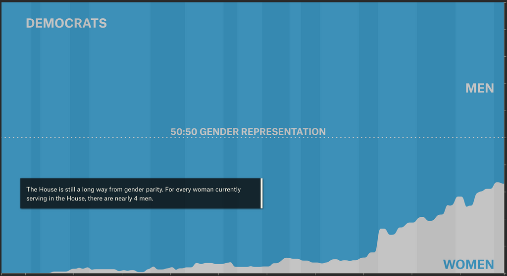
Film dialogue broken down by gender and age is the best piece in terms of page views. An analysis of the size of women’s pockets was the most talked about on social media.
“I pride myself on engagement time,” Russell says. The Structure of Stand-Up Comedy piece has one of the best times, with an average of around 12 minutes spent on the page.
Some pieces get awards, some pieces get lots of views, some get lots of shares. In the end, Russell says, they don’t have targets on this stuff. “Low expectations makes us more driven to experiment.”
That doesn’t stop the team promoting their work, though. Alongside standard social media outreach, they’ve got a sizeable email database which helps them let people know when new content is out.
“It’s a lot of word of mouth,” Caitlyn says and, looking at the number of recommendations on Slack, I totally believe her.
The Pudding only occasionally features sponsored posts so I was keen to find out how they keep things going, commercially speaking.
News to me was that The Pudding team is made up of the same people as the Polygraph team. Polygraph works with some huge organizations, like Google, YouTube, and Netflix, creating incredible visualizations for them alongside their work on The Pudding.
Caitlyn tells me that working with clients takes up most of her day. “To keep the lights on we do client work. But it’s all based on the joint vision of visual storytelling.”
Finding out that my go-to example of great data visualization is a side-project made me even more in awe of the Polygraph/The Pudding team.
Big thanks to Russell and Caitlyn for chatting to me. You can check out the latest from The Pudding here.
Offering up analysis and data on everything from the events of the day to the latest consumer trends. Subscribe to keep your finger on the world’s pulse.
Consumer Research gives you access to deep consumer insights from 100 million online sources and over 1.4 trillion posts.
Existing customer?Log in to access your existing Falcon products and data via the login menu on the top right of the page.New customer?You'll find the former Falcon products under 'Social Media Management' if you go to 'Our Suite' in the navigation.
Brandwatch acquired Paladin in March 2022. It's now called Influence, which is part of Brandwatch's Social Media Management solution.Want to access your Paladin account?Use the login menu at the top right corner.